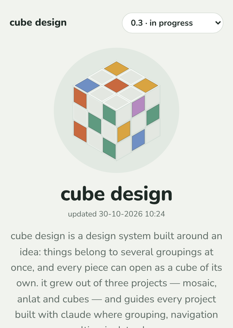
seen: 2026-10-30, cube design (this website), every page, on a phone. selim: "at the top right, it says versions. and that is a traditional way of building a website. and it makes sense for user behavior, but actually it is in conflict with a cube design. and i am curious how you're gonna fit that feature, the requirement, into the cube design without violating it." the same corner also held "how it grew", a page listing the versions with what each brought.
picture:
breaks: 5 and 6 (no base case; zoom is a change of distance), 25 (going out of a piece is zooming out: the picker jumped sideways to another version, neither in nor out), 17 (close up, the picker led from one piece straight to the same piece in another version), 29 (a cube opens on its shape: versions are a column of cube design, so they belong on its face), and the screen shape of 05-patterns.md.
why it feels wrong: a drop-down in the corner is chrome: a way of getting around that is not a piece, works on every page in the same way, and does not care where you are. what it held is real: cube design has a time, and each version is cube design as it was on a day. that is a kind of cube design, not a setting of the page. it was also two doors to one thing: the picker and "how it grew" both opened the versions, in two shapes. and on a piece close up, it jumped to the same piece in another version: a sideways move between two cubes, which is neither zoom in nor zoom out.
how it could follow (built at selim's ask the same day):
- versions is a face of cube design, beside pieces, layers, stages and readers. zooming into it shows every version as a piece (0.3, 0.2, 0.1, with its name and day), and zooming into one shows cube design as it was then, its own faces first. zooming out of a version goes back to versions, then to cube design.
- what "how it grew" said (new, grown, the same) is kept as a face of every version: changes, whose values are new, grown and the same, each holding the pieces it names.
- the newest version is cube design itself at the top and also one of its versions (
/v/0.3/), so going into it from versions is going in, never back out to where you came from. - the picker and "how it grew" are gone from the corner and the foot. what is lost: seeing one piece in another version straight from that piece; now it is versions › 0.2 › pieces › the piece, from afar (17).
status: fixed the same day, straight on main.