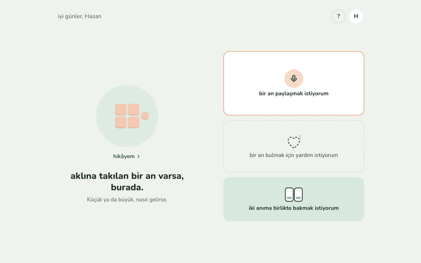
seen: 2026-10-30, anlat (live after round 2, anlat#76), the main screen on a desktop. selim: "hikâyem is standing next to it, and we have five items: the question mark for the guide, the profile letter for settings, bir an paylaşmak istiyorum, the help, and the looking at two things. they are listed."
picture:
breaks: 6 (zoom is a change of distance), 16 (every piece has the same shape), 1 and 3 (no axis is the master; sameness first), 7 (empty is the point), 24 (a face is a complete square), and the screen shape of 05-patterns.md (a cube on top, its pieces below).
why it feels wrong:
- five things at five distances, flattened into one. hikâyem is the whole cube seen from afar. "bir an paylaşmak istiyorum" is a move on that cube (collect). the help is a way into that move. yan yana is a look at two of hikâyem's pieces (a way of looking, like rotate). the ? is about anlat itself, and the letter is about the person (the one looking, the third side of open question 10). a thing, a move, a way into the move, a look and the looker sit side by side as if they were siblings. zoom is a change of distance, so things that live inside hikâyem (a look at its pieces, a way of adding one) should not stand beside it. yan yana looks at hikâyem's pieces from outside hikâyem.
- nothing is the same about them, so it is a menu, not a face. the pieces of a cube are siblings that are alike on some kind, which is why the cube can be turned. the only thing these five share is "things you can do from here". that is the toolbar or the folder that cube design replaces: one master grouping, "actions", with nothing to turn by.
- five shapes. two round buttons in a corner, a picture with a link under it, and three boxes in three different looks (white with a warm border, dashed, filled green) and three heights. every piece of a cube has the same shape (16). the dashed box borrows cube design's code for a place not filled yet (7) for an action, so the dashed line now means two things.
- not a square, and not the cube's pieces. on a desktop the boxes are a single column of three. the picture on the left looks like the cube on top, but the boxes on the right are not its pieces: none of them is a moment. the screen shape is followed in form and broken in meaning.
- navigation in the corners. since round 2, seninle ilgili and rehberim open in layers like pieces, but their doors are not pieces: they are chrome in a corner, a way of getting around that is neither zoom nor a tap on a piece.
what selim saw instead (2026-10-30, the same morning): the five are alike after all. none of them is the person's own; each is something the application offers: a way to share, a way into their story, help to find a moment, two moments side by side, their preferences, a guide. read that way they are siblings on one level, the entry points of the app, and more may come. "hikâyem is about the user: when they go in, they fall into their own world", so yan yana (a feature the app offers) does not belong inside it. the help and the microphone share something (both are ways to add a moment), but that does not oblige them to fold into one piece: the person may want them side by side (principle 26). the first reading above was right about the shapes, the corners and the missing square, and wrong to read different distances into what is one level of offers.
how it follows (decided 2026-10-30, built in anlat R59, anlat#83):
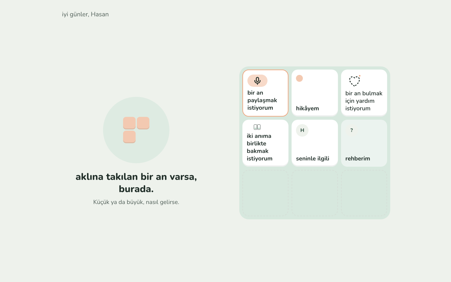
- the main screen is one face of the app's offers, all the same shape, in a complete square: bir an paylaşmak istiyorum, hikâyem, help in finding a moment, yan yana, seninle ilgili, rehberim. six pieces make a 3 × 3 on a wide screen; the three places not filled yet are outlined and are for the makers, not the person (there is no add box): new offers will fill them.
- the order is what the person uses most first, the guide last and quieter (principle 27). letting the person order them is parked for later.
- the greeting and the welcome stay as the head, with the gathering moments in the circle.
first proposal, not taken (kept, principle 18; mock-up: the main screen as one face):
- the main screen is anlat's outermost cube, as far out as anything is known (like the cubes app's home, its design decision 20). one face of pieces, the same shape, in a complete square: hikâyem (its tile holds the gathering moments), seninle ilgili (the person's initial), rehberim (a quiet ?) and the person's own box last, bir an paylaşmak istiyorum (the microphone). four pieces make a 2 × 2.
- yan yana goes inside hikâyem. it is a way of looking at hikâyem's pieces from afar (journey many, principle 17), so it is a piece of hikâyem's face beside anlarım and the details seen from afar.
- the help goes inside the own box. it is a way into sharing, so the share sheet offers it as one quiet line ("aklıma bir şey gelmiyor"). sharing itself stays one tap.
- the greeting and the welcome line stay as the head (on a desktop on the left, where the cube stands on other screens), and the 2 × 2 face sits on the right.
- what it costs: yan yana and the help are one tap further away, and rehberim is more visible than a ? in a corner (the guide must never be pushed, so its tile stays the palest). the other way, five pieces in a 3 × 3 with four open places, keeps everything in sight but is heavier for anlat's people.
status: fixed in anlat#83 (R59, merged 2026-10-30).